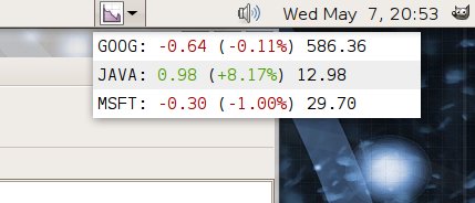
Thanks to the superb work of Matteo Zandi the invest applet has undergone some major improvements. If you ever worried about the strange grey square, then the next gnome-applets release if for you.
- The stock-health indicator has been integrated with the main icon, it now looks better and takes less space.
- Spark-lines show recent activity.
- Non-US stocks have better support.
- Column headings are now printed: you don’t have to guess what the numbers mean.
- You don’t have to right-click in exactly the right place to get the menu.
Matteo has more improvements in the pipeline, but for now here are the before and after shots.

before

after